
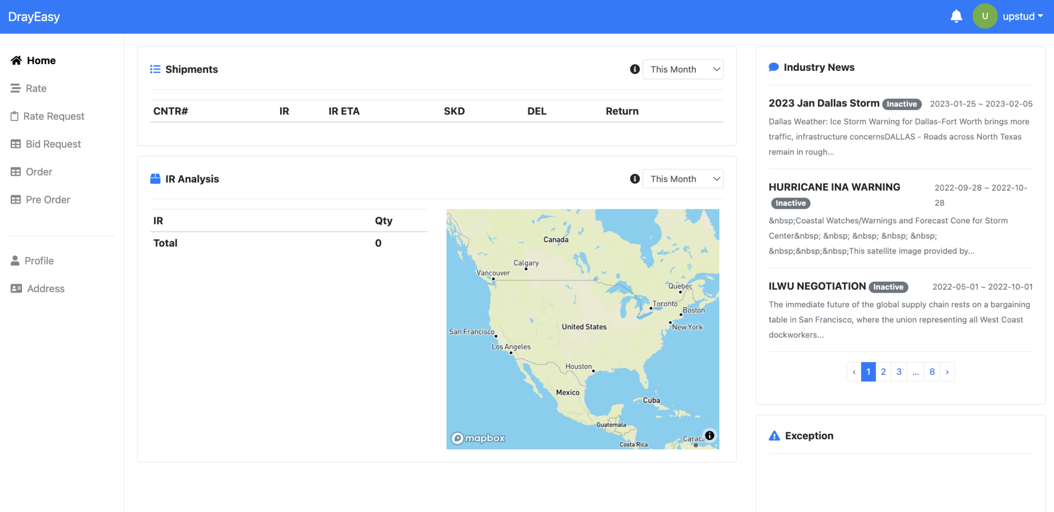
DrayEasy is a digital quoting and booking platform designed to assist freight forwarders and cargo owners in finding reliable logistics supply chains for transporting goods and containers across the United States.
Challenge
Due to the technically oriented visual and structural design of the website, users find it difficult to complete the entire journey from searching to comparing rates and booking.
Teammates
Bing Liu (Lead)
Wenxin Li (Me)
Sherry Wei
Su Wang
Huiyi An
Timeline
Mar 2023 - Jun 2023
(16 weeks)
Launched in Sep 2023
Toolkit
Figma
Mapbox
Adob Ilustrator
Photoshop
User Interview
Client
DrayEasy Inc.
Throughout the project, I collaborated with one product manager, one engineer, and one client representative. In the early stages, I participated in workshops for researching, ideating, and evaluating all features of the product. Starting from the wireframe stage, I, along with three other junior designers and one lead, dedicated ourselves to developing the rate comparing feature.
My contributions included conducting research, forming customer insights & ideation, holding stakeholder meetings, performing usability testing, creating prototypes, and completing the design system.
Our high level principle is redesign the user portal so that customers can rely on it for rate search, rate comparing and booking. With specific goals as follows:
1. allow users input search information
2. intuitively understand and compare rates
3. smoothly place orders with reliability
+34%
Route searches
success rate
-54%
Rate comparing time reduced rate
-61%
Rate comparison
error rate
Interview with stakeholders
Three goals of the meeting:
1. Understand type of targeted users;
2. Understand the detail process of searching, rate comparing and booking;
3. Gather client's pre-insights of ideas and user pain points.
Our design lead and I, alongside other designers, conducted a 60mins interview with a cross-functional team, including one client, one CTO (software engineer), and one customer to help us better understand the user experience and the product.
Pain points
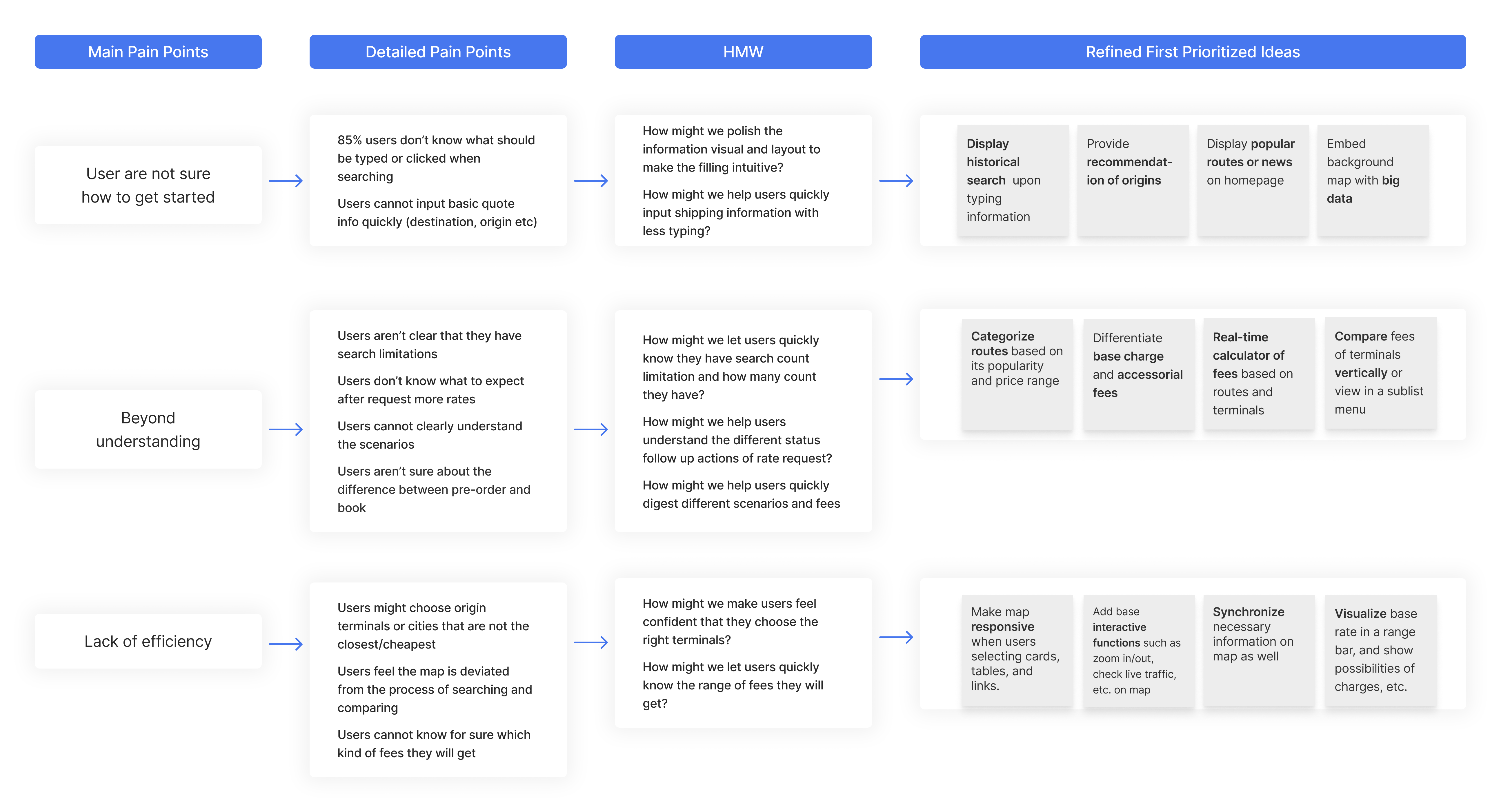
We interviewed five people to better understand users' emotions and mindsets when completing tasks—from searching and comparing to booking. Three pain points were identified:
01
User are not sure how to get started
"When I opened the main page, I saw a lot of long blank fields and a small button, and I don't know how to start."
02
Beyond understanding
"When I am comparing prices, there are many technical terms and abbreviations that I don't understand."
03
Lack of efficiency
"I need to spend a lot of time figuring out the relationship between the different pieces of information, which is very frustrating for me."
Reframe design question
The above findings help us further narrow down our problem statement, so we came up with our final design question:
• How do we design a more user-friendly portal that makes the process of searching, comparing, and booking more intuitive and efficient.


Who needs DrayEasy?
DrayEasy is essential for Freight Forwarders (FF) and Cargo Owners who act as agents, organizing shipments for shippers.
By researching, we learned the representative needs and concerns are:
1. Spending a lot of time searching for the right routes and comparing prices;
2. Often worry about the inaccuracy of the quoted prices, price fluctuations, and unreliable truckers;
3. Hoping to be able to place orders directly on a particular website;
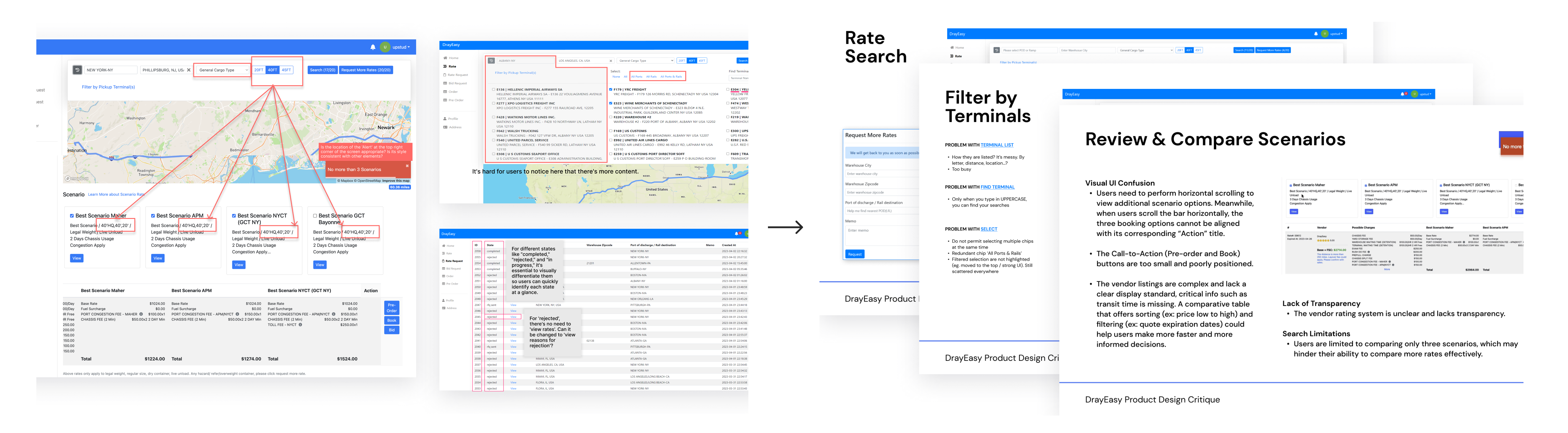
Workshop 1 - Internal product critic & present
We conducted a quick session of product critique to gather all ideas of refining. I organized data into a sliding deck and presented to a cross functional team, making sure product visions and decisions were aligned.
<See details>
Workshop 2 - Competitive analysis
We leaned from competitors how they perform on our priority features and gained valuable insights. We mainly looked into the user flow, information structure and visual.
<See details>
Organize ideas within the user flow framework
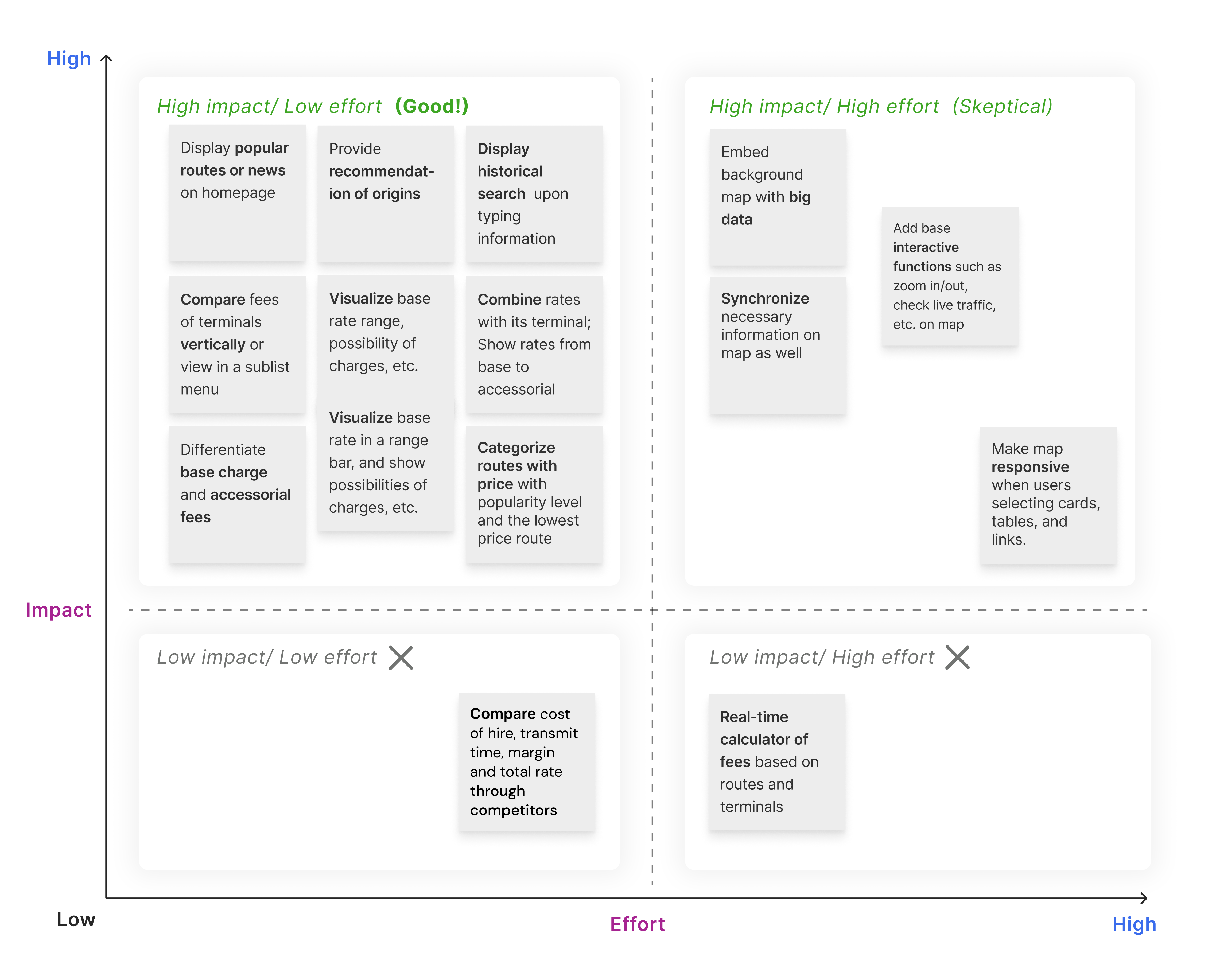
We began developing concepts and ideas, framing them within a process driven format. Subsequently, we voted, organized, and discussed the ideas on which we reached the highest consensus.
Refine ideas with customer value in mind
We then refined the ideas and solutions with a focus on empathy and customer value. This divergence-convergence ideation process helped us find the root problem and precisely meet users' needs and capabilities.
Evaluate ideas with a cross-functional team
After ideation, I invited the PM, designers, and the CTO for an evaluative workshop. The purpose was to further evaluate these ideas, identify the most priority features, and discuss their technical feasibility for me to proceed with the design process.
Explore from low-fidelity wireframes
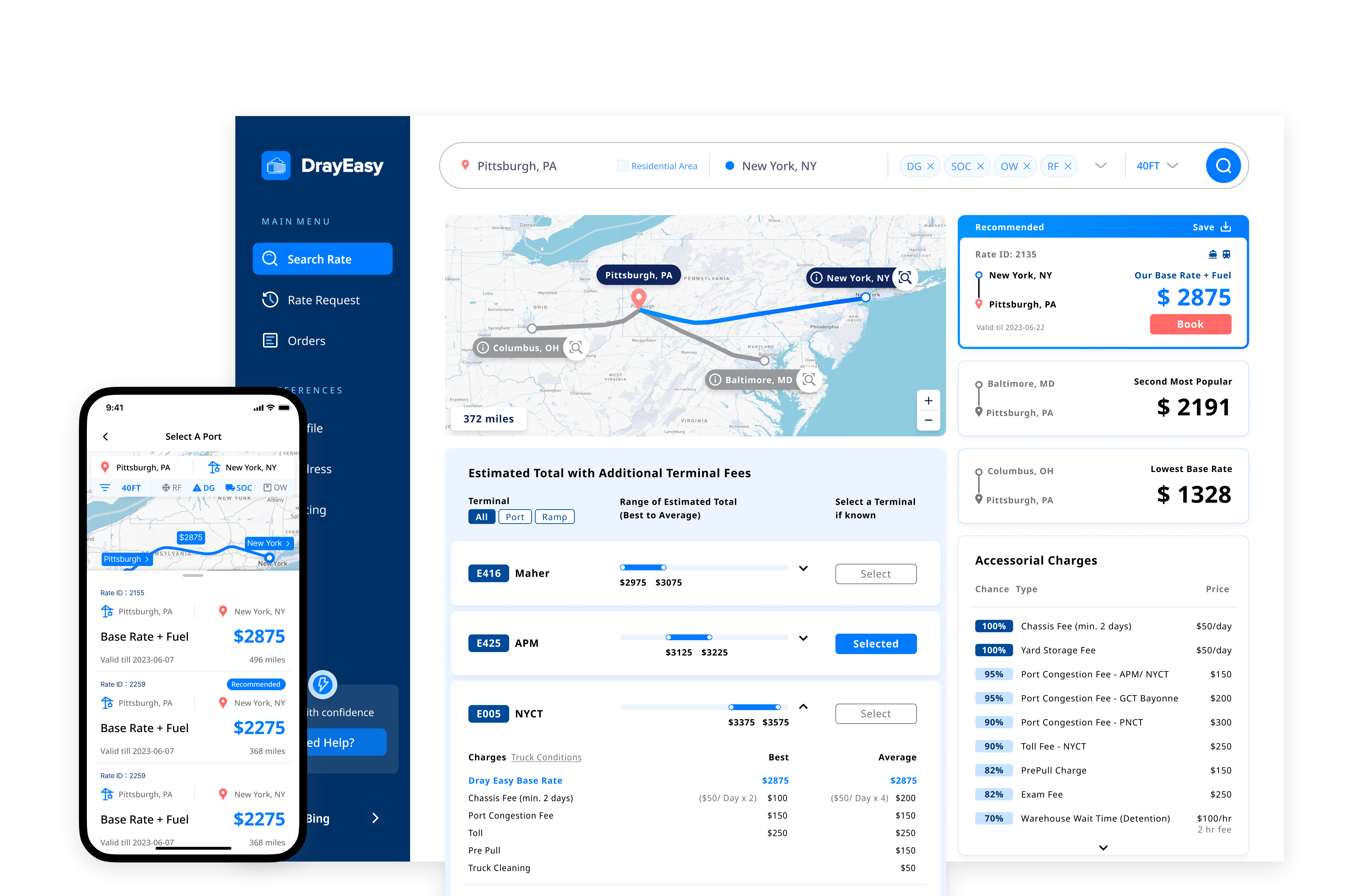
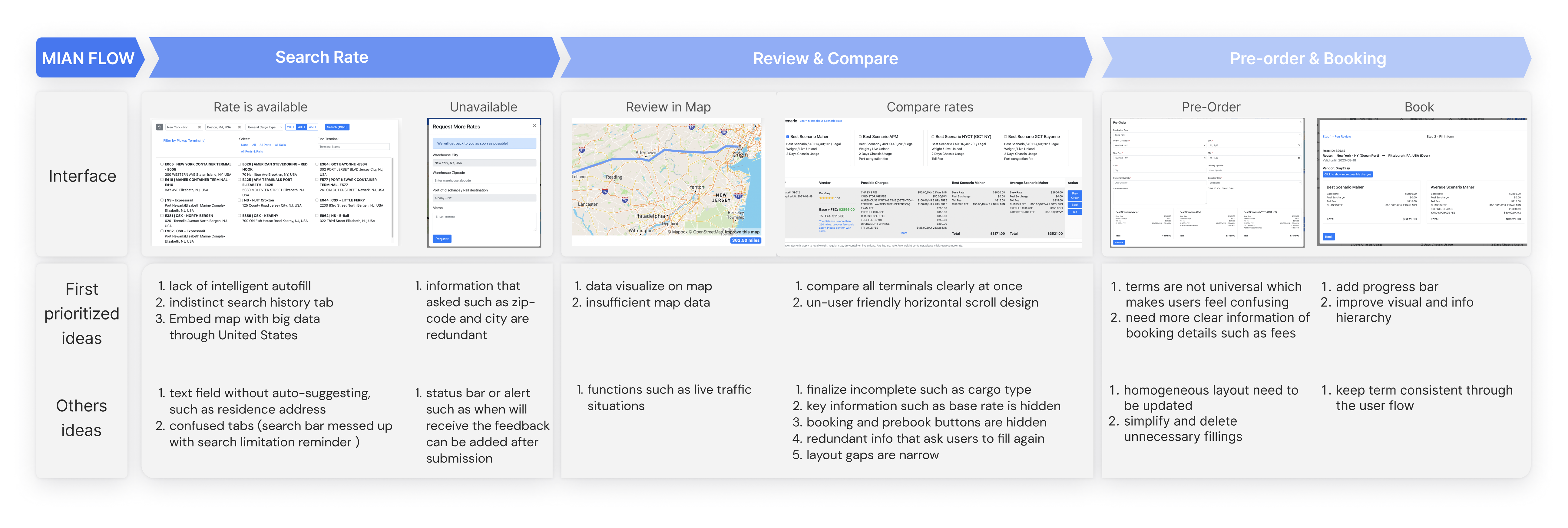
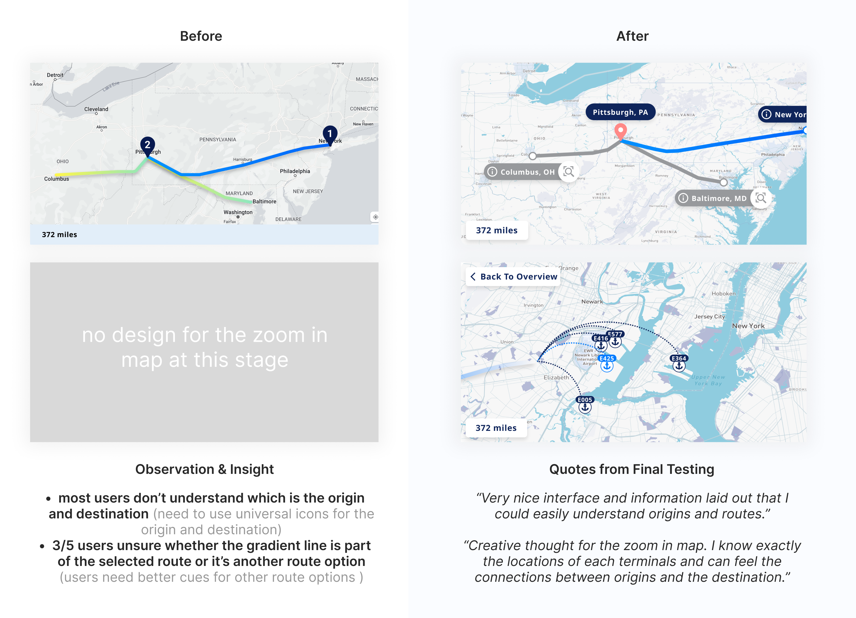
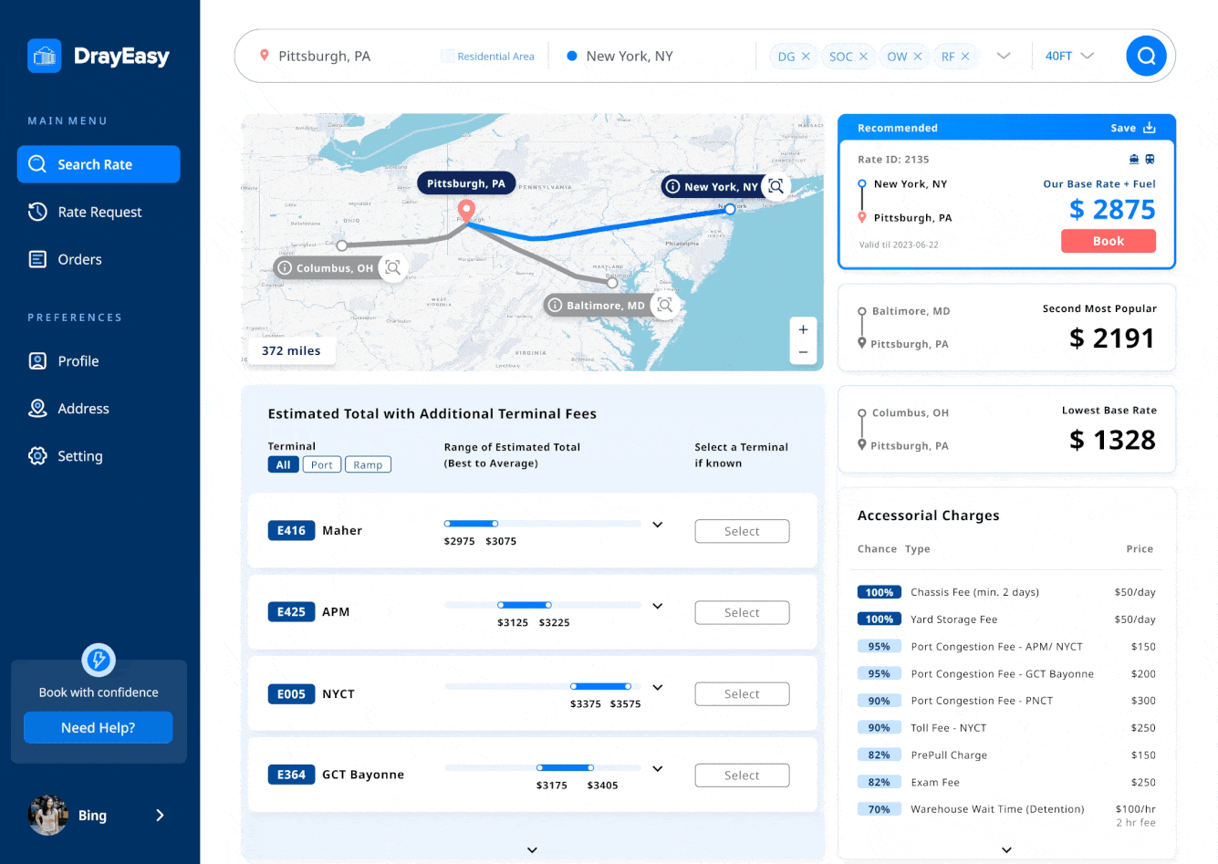
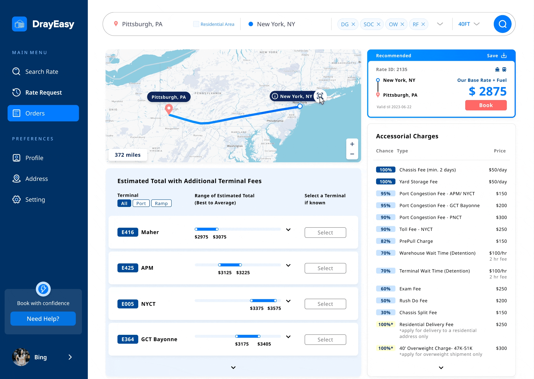
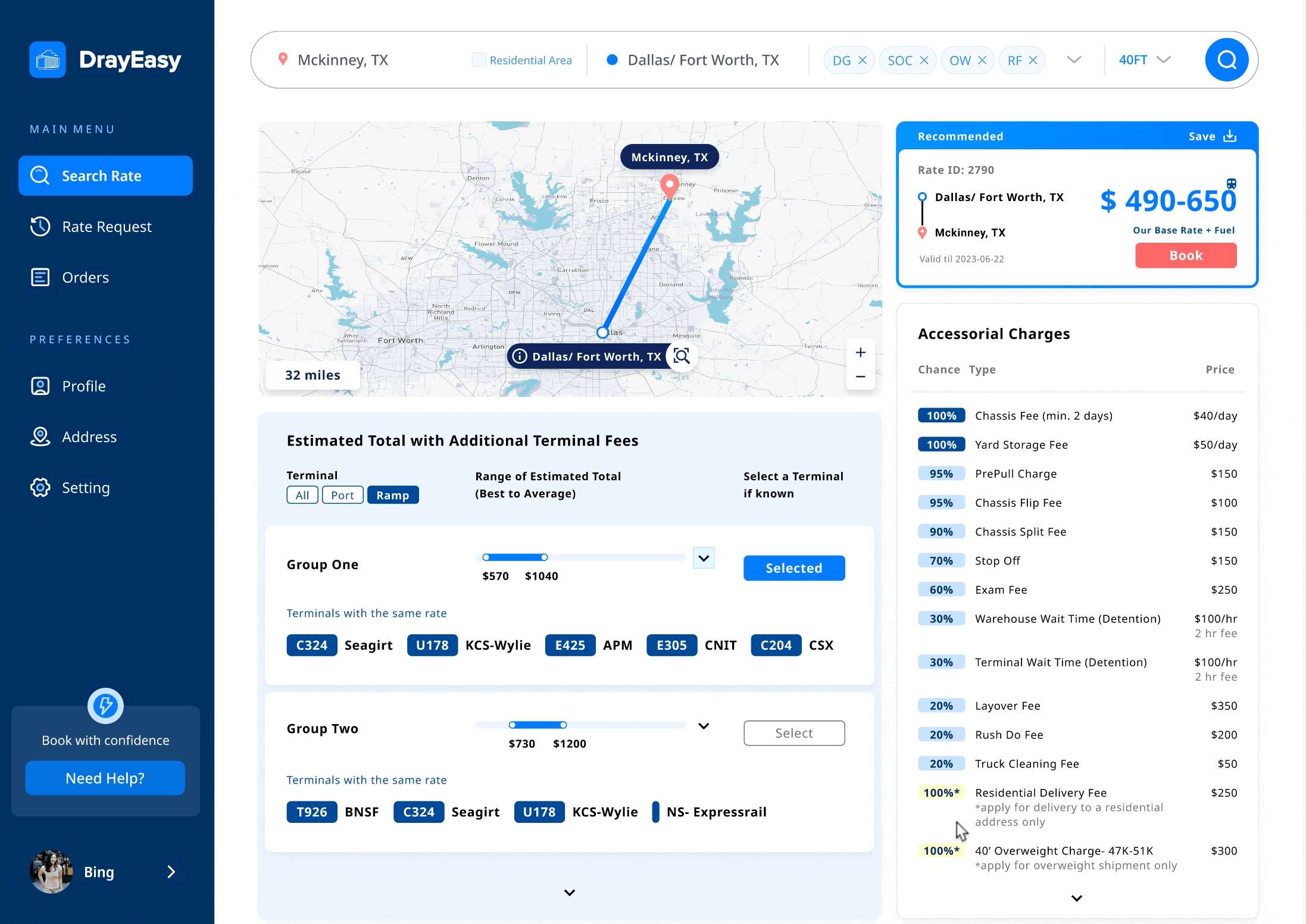
Three other designers and I focused on creating low-fidelity wireframes for the rate comparison page. After discussing with the PM, we settled on a design that features four sections with cards, a map, and tables. This layout clearly displays the route, base rate, price range, and accessorial fees, following the logical comparison process before booking.
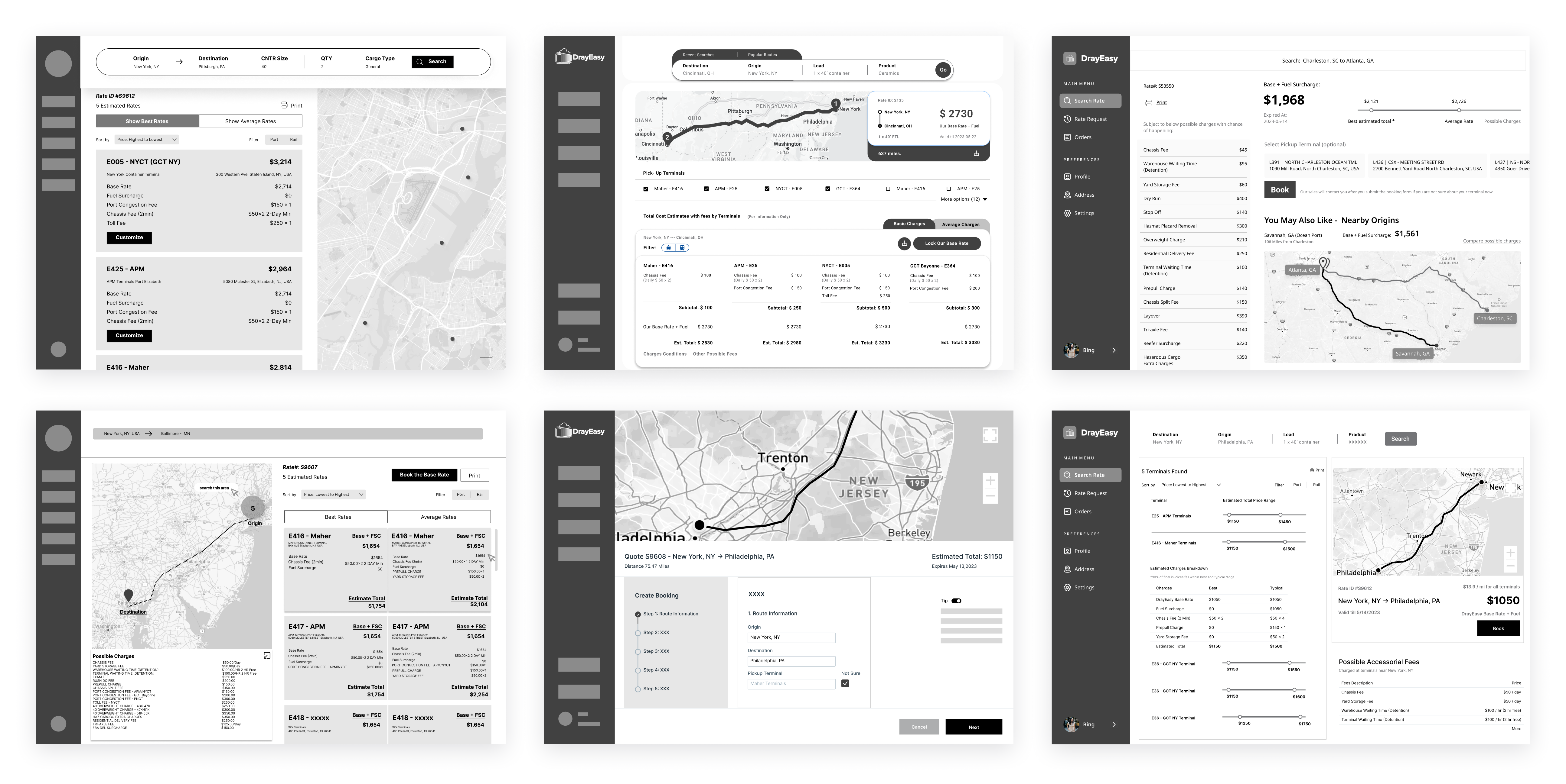
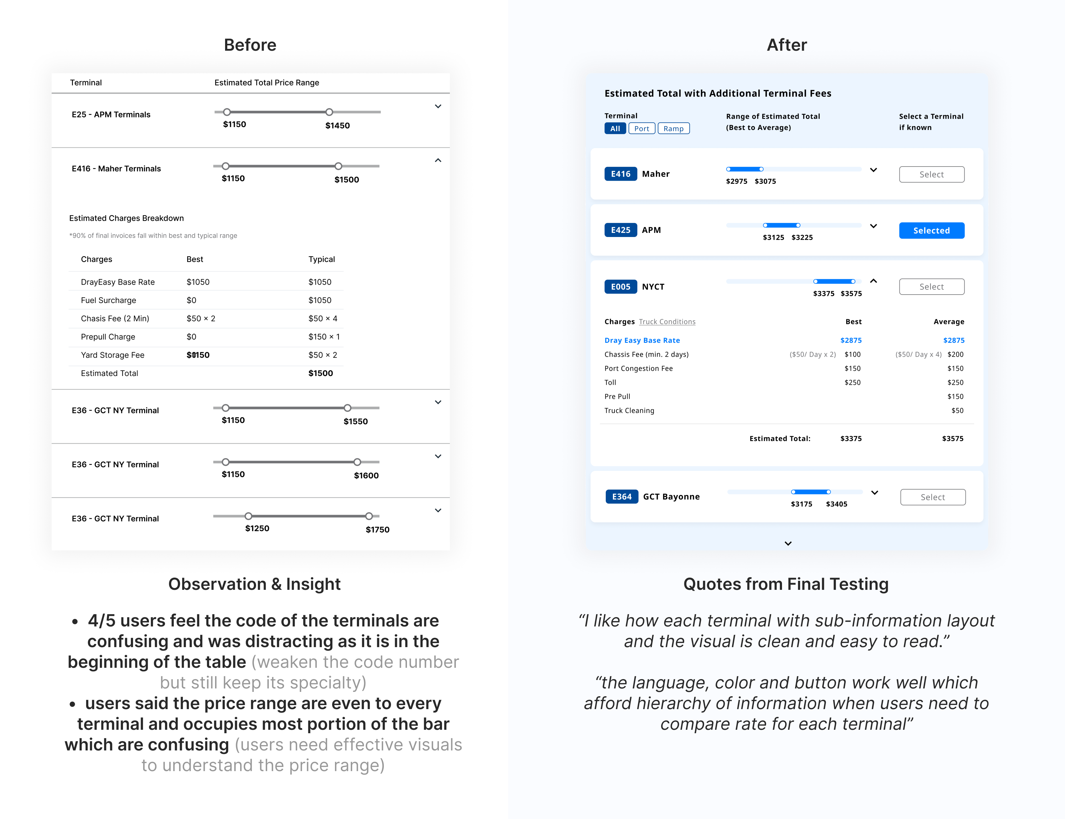
Iteration 01 - price range table for terminals
We conducted two moderated usability studies with five participants to test the mapping and tables. By recording and observing participants' reactions and comments, we identified patterns and iterated on the designs. At every stage, we reported to the PM for discussion.
The table showing the price range for each terminal aims to present a more accurate rate after checking the base rate card based on departures. After two rounds of iteration, the clients, CTO, and designers feel that the final table of price ranges is more comparable, digestible, and visually appealing.
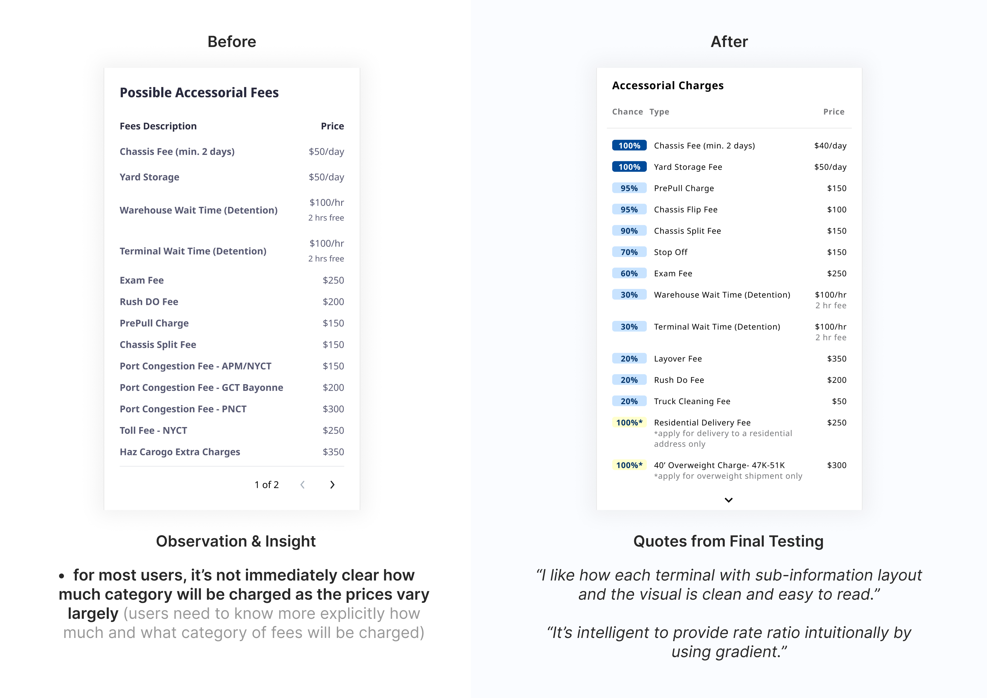
Iterations 02 - accessorial charges table
The accessorial charges table displays potential charges based on departure locations. Through discussions with stakeholders, we understood that these charges are often seen as less critical; they might not always apply and their costs are relatively small compared to the base rate. However, users wanted clearer information on the likelihood of being charged. User interviews revealed this discrepancy, prompting us to refine the design for a more reliable and user-friendly rate comparison experience.
Iterations 03 - interactive map
The interactive map visually displays routes, terminals, types of ports, and ramps, matching the content in the cards and tables. This makes it easier for users to compare information efficiently.
During testing, users hoped the map would offer features like zoom-in with pop-up information when transitioning from cards to tables. However, after discussions with the CTO, we decided against this due to technical limitations posed by the map being controlled by a third-party.
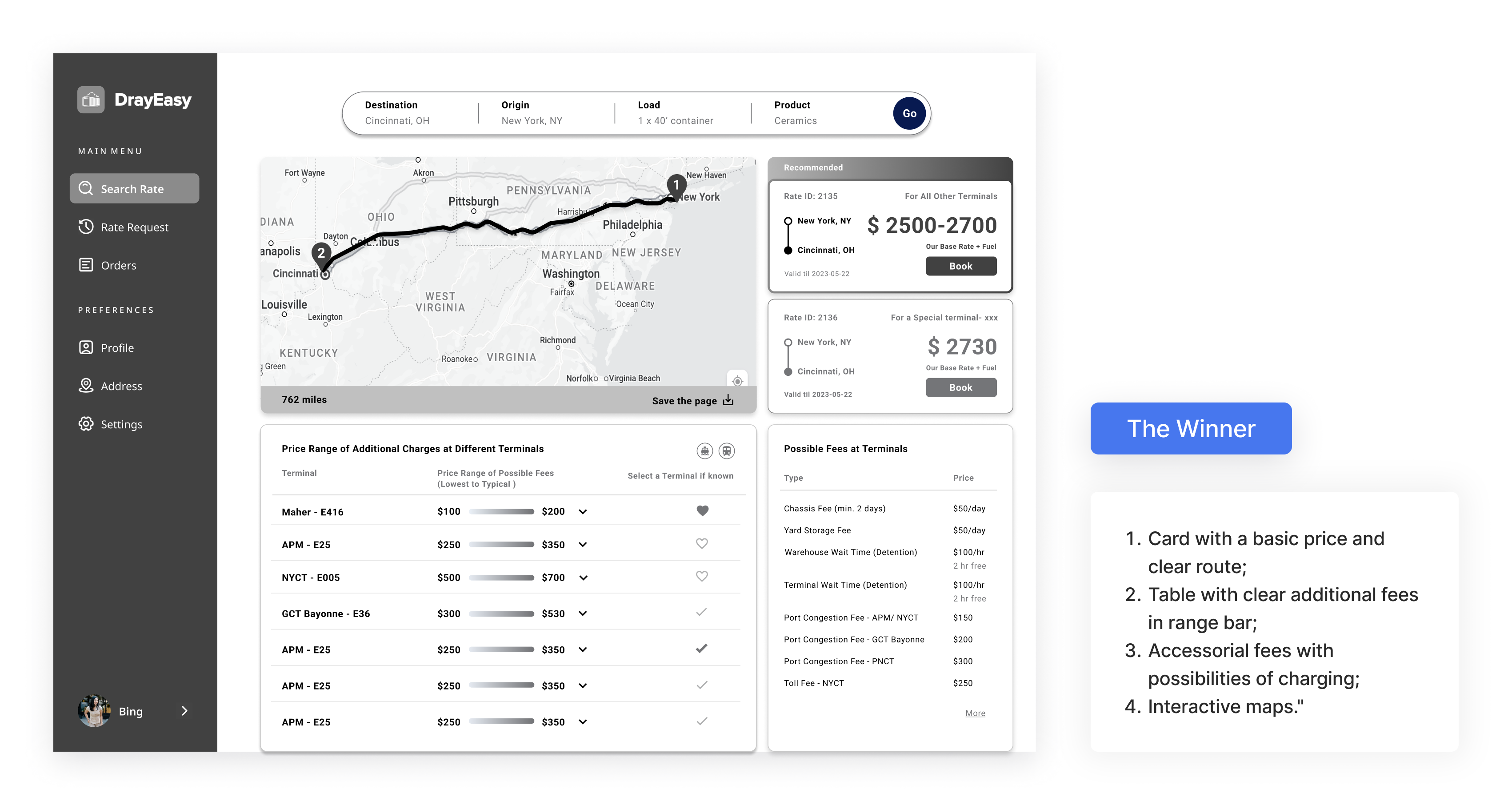
Challenge 1: Users are not sure how to get started
Solution: Create a homepage with a positive instructive significance, actively promoting features and intelligent search capabilities.
Main features: smart recommendation + popular routes
When customers are unfamiliar with the software or business processes, these functions guide them to choose the system-recommended route, creating a comfortable and user-friendly searching experience.
.gif)
Challenge 2: Users feel the contents always beyond understanding
Solution: Construct a clean rate comparing framework with cards, tables and crucial details.
Main features: base rate cards + price range table
The base rate cards highlight departure places and their rates, while the price range table displays prices with added fees based on the terminal associated with the selected departure. Detailed features like saving to desktop, terminal codes, and transportation types were added to create a user-friendly rate comparison portal.
Challenge 3: Users feel the process of rate comparing lack of efficiency
Solution: Design a interactive map with effective data and visual that correspond with process of rate comparing.
Main features: live updates + interactive map
Create a data visualization map that provides real-time updates on traffic conditions, matching the content in the cards and tables. This makes it easier for users to compare information efficiently.
Using the transferable skills I gained from Urban design, I led the team in using Mapbox and produced the final map. A minimalist approach enabled us to craft a more detailed base map.
Edge case: The basic rate in Dallas and Chicago vary based on the choice of terminal
Solution: a reasonable method to display prices for two specific cities
Main features: base rate in range + terminals in bundle
When meeting with the stakeholders, one developer informed us that the base rate for two cities changes depending on the choice of terminal. In order to ensure that the main content of the card remains unchanged, we proposed to provide users with a basic price range specifically for these two cities. At the same time, in the table, we bundled terminals with the same additional fee.
1. Quickly understanding domain knowledge in B2B product is the key
Grasping domain knowledge quickly is crucial to identify core user needs and align solutions with business objectives.
Without knowledge in joint transportation, it was hard for me to understand the product even compared to users, impacting our user research judgment. So, before conducting surveys and interviews, we immediately held meetings with stakeholders to inquire about domain knowledge, gather market research, clarify terminology, and internally test and critique the product. This helped us rapidly understand the domain, product user positioning and objectives, and accurately detect user needs and patterns during usability testing.
2. Affordances in user interfaces enhance fluid user flow
In the search field, we employed explicit affordances to make information and buttons discoverable and understandable. In the terminal-related table, we hid the additional fee under a dropdown menu. Overall, we adopted familiar UI patterns, like cards and price range bars, to instinctively aid users in comparisons and inquiries.
3. Communication Between Designers, Developers, and Engineers During Product Development
The product redesign was based on a very basic test version, so 90% of the interface changed. Despite numerous meetings, we had to forgo some features due to technical constraints. The final launched version had some differences from the hi-fi version, such as the map scale display. While some aspects were overlooked for the sake of progress, proactive follow-ups led us to conduct further iterative tests.
4. Balancing User Needs and Business Goals
Given development time constraints, we prioritized features by balancing user needs and business objectives. Designing effective B2B SaaS products involves carefully weighing user requirements against the need to produce results that meet business expectations and drive revenue.